
Sometimes quilting can get quite stressful, not the relaxing past-time it’s meant to be! I’m trying to choose colours for the next border for my Down the Rabbit Hole quilt and I’m on about my sixth attempt at colour combination, so I decided it was time to ask for help…
This is my quilt so far…

The next border has got half dresden circle flowers in the centre of each side. The sunflowers in the corners will be completed next month onto this border too. My background is a lovely passion flower design from Lewis & Irene, soft grey with a touch of that limey green. I think my problem is that the pieces are fairly big, so they appear quite dominant, all the colours I’ve tried are already in the quilt in either the flowers or the houses but somehow they seem stronger in the flowers.

This was my first choice, these are from the original layer cake that started my colours. I felt the cream and the olive green co-ordinated with the background colours, but somehow with the purples it seemed very dominant. The flowery purple on the right side below is the outer border fabric, though there is another pieced border in between.

I tried my gorgeous bee fabric, fussycut with a bee on each petal, with olive inbetween or a blue/green. I love the bee, but is it too fussy against the background, getting a bit lost.

bees with cream…

I like my softer shades of purple inside, but is it better with the original outside, maybe with the bees in the centre!!

Any thoughts welcome as I’ve lost the plot 🙂
Update!
How about this one, getting better? I couldn’t face cutting a whole set again, but hopefully it gives the idea! I think I need to sleep on this one!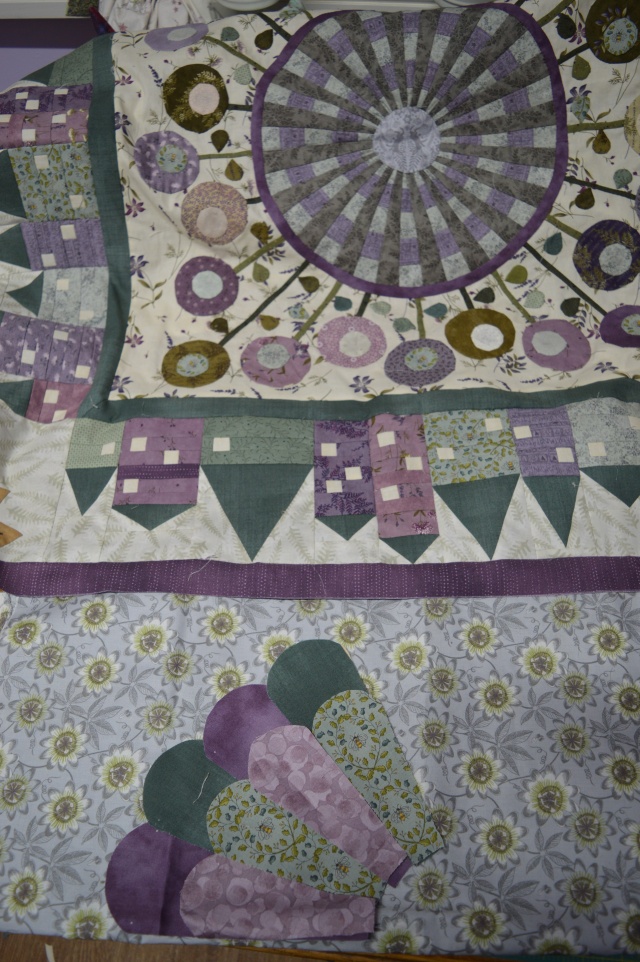


I wonder if you perhaps need to look at a different background, something that has a similar feel (is that the right word?) as the backgrounds in the center panel and the rows of houses. To me it appears as a soft ivory, but that could be my screen.
LikeLiked by 1 person
Thanks Irene, I’d rather keep this border fabric if poss as in real life it’s not such a dominant pattern and the colours blend well with my other fabrics. I’ve tried another colour scheme added a photo at the end, see what you think
LikeLike
I really really love the second last photo, but I kinda agree with Irene above that perhaps you need to switch out the background fabric with one with lots of texture and less pattern. It’s so pretty you really cannot go wrong. LUcky you.
LikeLiked by 1 person
Thanks for your suggestions, I’ve added another photo at the end which I think might be an improvement
LikeLike
I am getting this BOM but still haven’t had time to start it. Your Dresden’s seem to be fighting the background, so as the two ladies above state, something lighter. If you were determined to use the background you have chosen, which is very pretty, I would remake the Dresden’s with the Dark colors being the outside blade sections to contrast with that background. I own a brick and mortar quilt shop and try not to influence quilter’s choices of fabrics because often what they think turns out very well. It is going to be a Gorgeous quilt no matter what you decide and I am happy to see your posts of the progression!! take care from Iowa
LikeLiked by 1 person
Thanks Melody, I would prefer to use this background if poss, I’ve just added another photo which has darker, plainish fabrics on the outside, I think it’s an improvement, what do you think?
LikeLike
I reckon you’ve cracked it with that update photo! I’d suggest putting that strong olive green centre on the dresden as otherwise it’s a bit absent from the combination, and it helps to tie everything together back to the centre without being as dominant as it was in the first option. Love the passionflower fabric, don’t change that, it’s perfect!
LikeLiked by 1 person
Thanks Kate, olive in the middle sounds good 🙂
LikeLiked by 1 person
Did you try the gold from the first photo with the bees and a darker purple center? It may be too dull, but with the purple border coming next, it might work?
LikeLiked by 1 person
Thanks Kathy, I’ll give it a go, I’ve got lots of pieces to play with now!!
LikeLiked by 1 person
You sure do, this will be gorgeous when complete, no matter what you pick in the end. 😊
LikeLike
I like the last photo the best! Good luck. It’s so frustrating when your vision isn’t coming out as you see it in your head.
LikeLiked by 1 person
Absolutely no idea, Lovely One, but remember you can always disregard all advice in the end. Sometimes it all just helps solidify an initial decision that was a bit waffley at first. 😉
LikeLiked by 1 person
This is a fabulous quilt. I think your final picture of dark green and purple will work vey well.
LikeLiked by 1 person
Thanks Jane, I certainly think the outer ring is right there, still not 100% on the bees even though I love them!
LikeLike
Thanks Jane, I think I’ve cracked with the outer ring, just not 100% on the bees, even though I love them 🙂
LikeLike
I actually like your first choice but I agree that a couple of the purples make it seem to dominate a bit. I love the gold and cream outer though. What about substituting the darker purples in the first choice for the blue green petals you try later on.
If not, I like the third option with the original gold and cream but with softer purples and the bee centre – although I think you could get away with a dark purple centre there too.
Whichever option you go for it’s going to look amazing.
LikeLiked by 1 person
Thanks Tialys, I think I’ll have another play with all these suggestions tonight and make a decision!
LikeLike
Oh dear, I don’t like the dresden design here, its too different. Not much help sorry.
LikeLike
That’s OK Cathy, I think it echo’s the dresden in the middle, I’m just trusting Sarah to have designed a balanced quilt 🙂
LikeLike
I love your last picture! The sunflower fabric is gorgeous, but I think to give it justice it does need to be separated from the bees (equally gorgeous) with plain colours. So your last combination works a treat (in my opinion). This is an absolutely fabulous quilt, and to be honest, none of the above options will spoil it, so follow your heart 🙂 I look forward to see what you go for!!
LikeLiked by 1 person
Thanks Faby, I think I’m almost there with the last one 🙂
LikeLike
I’m not sure about your background fabric for dresden plate. In my view, it needs to be plainer, with no distinct pattern so then the dresden plate will really stand out
LikeLike
I think choosing fabrics is the hardest bit of quilting, stitching the bits together is the easy bit! All four main borders have got a patterned background and this one isn’t as obvious in real life as it appears in the photos, I’ll have a play with another one though 🙂
LikeLike
Hi, I’m also doing BOM and sympathise. This next step is tricky. When I look at overall sketch from Sarah, the outer borders do seem to dominate the centre. I therefore think your first choice would work, but last one good too. Are you doing rabbits, cats or flowers I wonder. More choices 😍
LikeLiked by 1 person
Thanks Jane, it is tricky! I’m doing light grey rabbits bounding through the purple field of flowers!! So I’m hoping the grey of this border will link together the grey of the centre circle and the grey of the rabbits, together with a touch of olive green to link with the flowers…that’s my plan anyway!!
LikeLike
I actually liked your first choice too. I hope you made a decision – sometimes putting something down and returning to it later gives you a ‘lightbulb moment’ !
LikeLike